When users land on a website, they don’t process all the content at once—they scan the page in a specific way. This is where visual hierarchy comes into play. It helps guide users’ eyes to the most important elements first, improving navigation, readability, and conversions.
Let’s dive into the key aspects of visual hierarchy and how to apply them to your website.
1.What is Visual Hierarchy?
Visual hierarchy is the arrangement of design elements in a way that naturally directs attention to the most important content. It ensures that users process information in the correct order and don’t feel lost.
2.The F-Pattern and Z-Pattern Scanning
Users follow predictable patterns when scanning a webpage:
- F-Pattern: Users first scan horizontally across the top, then move down the left side, occasionally scanning across. This is common on content-heavy pages like blogs.
- Z-Pattern: Users scan in a Z-shape—starting from the top left, moving to the right, then diagonally down. This is common on landing pages and minimalist designs.
3. Size and Scale
Larger elements attract more attention. Use bigger fonts for headlines and key messages, while keeping supporting text smaller.
✅ Example: Your main CTA button should be bigger and more prominent than other links.
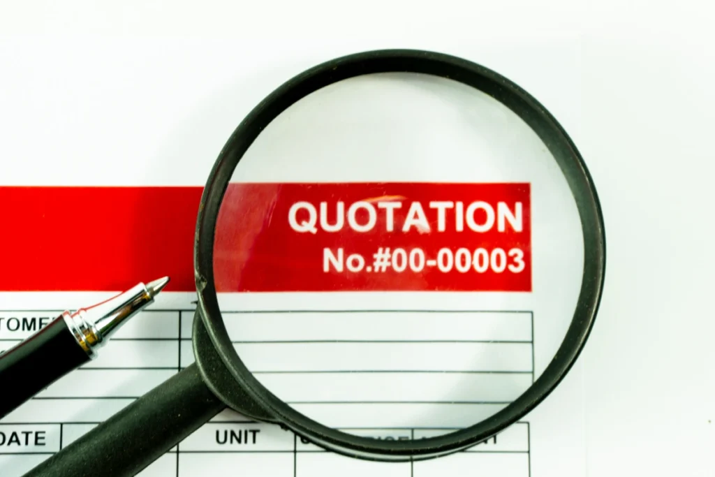
Get a Quote
Ready to take your business to the next level? Get a custom quote for a web design solution tailored to meet your needs. Click below to receive a personalized estimate and start your journey toward a powerful online presence.”
4. Color Contrast
Contrast helps elements stand out. High contrast between text and background improves readability, while bold colors highlight CTAs.
Example:
🔵 A blue “Buy Now” button stands out on a white background.
⚫ A black button blends in and gets ignored.
5. Whitespace (Negative Space)
Whitespace isn’t empty space—it’s a powerful tool for improving readability and focus. Spacing out elements makes content easier to consume.
Best Practices:
✅ Leave space around important elements.
✅ Avoid cramming too much content into one area.
6. Typography and Font Choices
Fonts impact readability and perception. Use:
- Bold fonts for headings.
- Regular fonts for body text.
- Script or decorative fonts sparingly (for branding elements only).
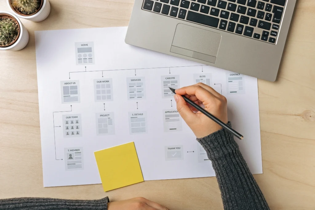
7. Alignment and Layout
Well-aligned content looks professional and improves readability. Stick to a consistent grid layout to ensure a balanced design.

What Our Clients Say
Don’t just take our word for it—hear directly from the businesses we’ve helped grow. Read testimonials from our satisfied clients and learn why they trust us with their web design needs.
8. Visual Cues and Direction
Use arrows, lines, or gaze direction in images to guide users toward key content. For example, if a person in an image is looking at a CTA button, users will instinctively look there too.
9. Prioritize Content
Not everything is equally important. Structure your content so that key messages come first, followed by supporting details.
10. Testing and Iteration
Use A/B testing to see how different layouts affect user behavior. Tools like Google Optimize and Hotjar can help analyze user interaction.
By mastering visual hierarchy, you can design websites that are not only beautiful but also highly functional. A clear, well-structured design improves user engagement, reduces bounce rates, and drives conversions.

Our Web Design Packages
Looking for a web design package that suits your budget and business needs? Explore our flexible packages designed to provide the right level of service, whether you’re just starting out or need a comprehensive design overhaul.