Is SEO Dead in 2025? Here’s the Truth (And How to Win at Modern SEO)

gtmetrix performance report

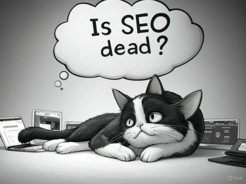
If you’ve been wondering, “Is SEO dead?” — you’re not alone, I was too.

With all the changes in search algorithms, AI-powered tools, and Google’s evolving Search Generative Experience (SGE), many marketers are asking the same thing. But let’s set the record straight:


SEO is not dead. It’s just growing up.

Famous old-school tactics like keyword stuffing, spammy backlinks, and thin content are long gone. Today, SEO is about delivering real value to real people — and making sure your content stands out in a smarter, AI-driven search landscape.

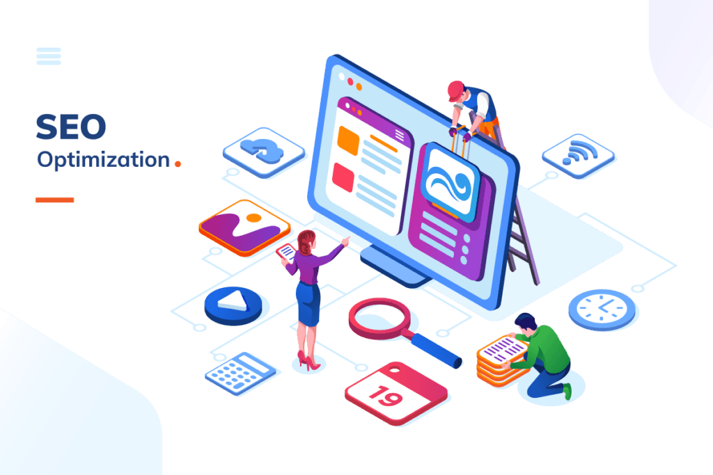
So how do you win at SEO in 2025? Let’s break it down.


Match Content with Search Intent

Gone are the days of chasing keywords without context. Today, it’s all about understanding search intent — the reason behind a user’s search.

There are four main types of search intent:

  • Informational – “How to start a blog”
  • Navigational – “Joomla Sri Lanka homepage”
  • Transactional – “Buy blackout blinds online”
  • Commercial Investigation – “Best smartphones under $300”

Action Step: Map each page or blog post to a specific intent. Don’t try to mix them — it confuses both Google and your visitors. Tools like Moz Pro are especially helpful here, as they emphasize classifying keywords by search intent to guide your content strategy more effectively.

Create Helpful, Human-Centered Content

The Google Helpful Content updates shook the SEO world — and for good reason. Thin, robotic, or purely AI-generated content won’t cut it anymore.

Instead, aim for:

  • Detailed, well-structured articles
  • Real examples, step-by-step guides, and visuals
  • FAQs to anticipate user questions
  • Conversational tone that keeps readers engaged

Pro Tip: Use tools like ChatGPT for brainstorming and outlines — but add your own voice and value.

Go Beyond Keywords with Semantic SEO

Google now understands topics, not just keywords. That’s why semantic SEO is key to modern success.

If you’re writing about “best home coffee machines,” also include related terms like:

  • Espresso makers
  • Coffee grinders
  • Barista tips
  • Brewing methods

Action Step: Use tools like Frase, SurferSEO, or Answer the Public to find related terms and questions.

Optimize for Speed & Core Web Vitals

User experience (UX) is now a ranking factor, and Google’s Core Web Vitals are part of the equation. These include:

  • LCP (Largest Contentful Paint)
  • FID (First Input Delay)
  • CLS (Cumulative Layout Shift)

Your site should:

  • Load in under 3 seconds
  • Be fully responsive on mobile
  • Avoid layout shifts and pop-ups

Tools to Use:

If you need a professional web design company to handle your website optimization, contact Mobiz International for sure fire results.

Use Structured Data (Schema Markup)

Schema markup tells search engines exactly what your content is about — making you eligible for rich snippets like:

  • Star ratings
  • FAQs
  • Product pricing
  • Event details

Action Step: Add relevant schema for each page using Google’s Rich Results Test or plugins like Rank Math or Schema Pro.


Build Authority with E-E-A-T

E-E-A-T stands for Experience, Expertise, Authoritativeness, and Trustworthiness. It’s a big deal in YMYL (Your Money, Your Life) topics — like health, finance, or legal content.

Here’s how to show E-E-A-T:

  • Add real author bios with credentials
  • Link to high-quality sources
  • Get backlinks from reputable websites
  • Be transparent about your business, services, and contact info

Tools like Moz Pro can help support your E-E-A-T strategy by analyzing domain authority, tracking link quality, and uncovering keyword opportunities within your niche — all of which contribute to a more authoritative and trustworthy online presence.

Embrace AI and Google’s SGE

Google’s Search Generative Experience is changing how people interact with search — blending AI summaries with web results.

To stay visible:

  • Use clear, structured formatting (H2s, lists, tables)
  • Answer questions concisely
  • Optimize for featured snippets
  • Include visual content like infographics or videos

Pro Tip: Create content that’s so helpful it can be quoted or summarized by AI — this is the new “Position 0.”


Don’t Ignore Local SEO (If You’re a Local Biz)

Local businesses must optimize for local visibility. That includes:

  • Claiming and optimizing your Google Business Profile
  • Collecting reviews
  • Creating localized content
  • Building consistent citations (name, address, phone)


Final Thoughts: SEO Is Not Dead — It’s Just Evolving

In 2025 and beyond, SEO is about value, trust, and user experience. It’s about aligning your website and content with what people genuinely want — and making sure search engines understand that clearly.

Whether you’re running a blog, an e-commerce store, or a local business website, SEO is still one of the most powerful long-term strategies to grow online.

So no, SEO isn’t dead — it just grew up. Are you ready to evolve with it?


Ready to Upgrade Your SEO Strategy?

Whether you’re looking to improve your rankings, attract the right audience, or future-proof your website for the evolving world of search — we’re here to help.

Contact the SEO experts at Mobiz International for a personalized strategy session.
Let’s turn your website into a traffic-generating, lead-converting machine.

Call Us Now or , Send a Message

Visit: www.joomlasrilanka.com

Cybersource Secure Acceptance Plugin for WordPress: Seamless Payment Processing

In the ever-evolving digital landscape, offering secure and seamless payment processing is crucial for businesses operating online. Cybersource Secure Acceptance Plugin is a powerful WordPress plugin designed to integrate Cybersource’s payment gateway into your website, ensuring safe and efficient transactions. This plugin leverages Cybersource Secure Acceptance to enable merchants to accept payments through a secure, hosted checkout experience.


Key Features of Cybersource Secure Acceptance Plugin

The Cybersource Secure Acceptance Plugin comes with an array of features that streamline the payment process while maintaining security and flexibility.


01.Secure Payment Processing

The plugin allows for a redirect-based payment model, ensuring that sensitive payment details are handled securely by Cybersource, reducing compliance burdens on merchants.


02.Customizable Payment Form

With the [cybersource_payment_form] shortcode, merchants can easily integrate a customizable payment form into their website.


03.Multiple Environment Support

The plugin supports different environments:

  • Test Mode (for development and testing)
  • Production Mode (for live transactions)
  • Production (India) mode for businesses operating in India

04.Transaction Types

Merchants can configure transaction types as either Authorization or Sale based on their requirements.


05.Admin Dashboard Settings

The plugin includes a user-friendly admin panel that allows merchants to configure:

  • Profile ID
  • Access Key
  • Secret Key
  • Currency and Locale
  • Transaction Type
  • Environment


06.Real-time Order Processing

The plugin enables automatic redirection to Cybersource’s payment page and processes payment responses efficiently, handling both successful transactions and failures.


07.AJAX-Based Credential Testing

An integrated “Test Credentials” button in the admin panel allows for easy validation of Cybersource API credentials without initiating a real transaction.


Installation and Setup

Setting up the Cybersource Secure Acceptance Plugin is straightforward and requires just a few steps.

  1. Download the plugin from the provided source or upload it to your WordPress installation.
  2. Navigate to Plugins > Add New in your WordPress admin panel.
  3. Click Upload Plugin, select the plugin ZIP file, and install it.
  4. Activate the plugin.
  1. Navigate to Cybersource Secure Acceptance under the WordPress admin menu.
  2. Enter the following credentials (provided by Cybersource):
    • Profile ID
    • Access Key
    • Secret Key
  3. Select the appropriate Environment (Test or Production).
  4. Configure additional settings like Currency, Locale, and Transaction Type.
  5. Click Save Changes.

Use the shortcode [cybersource_payment_form] to display the payment form on any page or post.

How the Plugin Works

  1. User fills out the payment form on the website.
  2. Data validation occurs before submission.
  3. The form redirects the user to Cybersource’s secure hosted payment page.
  4. User completes the payment using their preferred method.
  5. Cybersource processes the transaction and redirects the user back to the website.
  6. The plugin validates the response and updates transaction records accordingly.


Handling Payment Responses

The plugin listens for Cybersource payment responses and handles them efficiently:

  • Success: The order is marked as paid, and the customer is redirected to a confirmation page.
  • Failure: The customer is informed about the failed transaction and prompted to try again.
  • Cancellation: If the user cancels the transaction, they are redirected to a cancellation page with appropriate messaging.


Why Choose Cybersource Secure Acceptance Plugin?

  1. Highly Secure: Redirection to Cybersource for payments reduces the risk of storing sensitive card data on your website.
  2. Seamless Checkout Experience: Customers are redirected to a secure, mobile-friendly checkout page.
  3. Easy Integration: The shortcode-based payment form simplifies the integration process.
  4. Minimal Compliance Requirements: Since the payment is processed on Cybersource’s end, merchants are not directly handling cardholder data, reducing PCI compliance requirements.
  5. Scalability: Suitable for small businesses and large enterprises alike, handling multiple transactions securely.


The Cybersource Secure Acceptance Plugin is an essential tool for WordPress users looking to integrate secure and efficient payment processing into their websites. With its robust features, user-friendly admin panel, and seamless checkout experience, it ensures that businesses can accept payments with confidence.

Ready to simplify your payment processing? Install and configure the Cybersource Secure Acceptance Plugin today!

Website Speed and Performance: Why It’s Crucial for SEO and UX

A slow website is one of the biggest conversion killers. If your website doesn’t load within 3 seconds, you could be losing 50% of potential customers. Additionally, Google considers website speed a ranking factor, meaning slow-loading websites perform poorly in search results.

Let’s explore why website speed matters and how you can improve it.

1.How Website Speed Affects SEO

Google rewards fast websites with higher rankings in search results. If your website loads slowly, search engines may rank it lower, leading to:

Less organic traffic
Lower engagement
Higher bounce rates

A fast website improves SEO and helps attract more visitors.

2.The Impact of Speed on User Experience (UX)

Users expect instant page loading. A slow site frustrates visitors and reduces engagement. Studies show that:

🚀 1-second delay in page load time can reduce conversions by 7%
🚀 40% of users leave a site if it takes longer than 3 seconds to load.

Get a Quote

Ready to take your business to the next level? Get a custom quote for a web design solution tailored to meet your needs. Click below to receive a personalized estimate and start your journey toward a powerful online presence.”

3.How to Improve Website Speed

Optimize Images – Use compressed images (JPEG, PNG, or WebP formats) to reduce file size without compromising quality.
Minimize HTTP Requests – Reduce the number of elements (scripts, images, and stylesheets) that need to load.
Enable Browser Caching – Store static files in users’ browsers to speed up returning visits.
Use a Content Delivery Network (CDN) – A CDN stores website content across multiple locations, improving load speed globally.
Reduce Redirects – Too many redirects slow down page speed. Only use them when necessary.
Use Lightweight Themes and Plugins – Avoid bloated website themes and excessive plugins that slow down performance.
Enable Lazy Loading – Load images and videos only when users scroll to them instead of all at once.

4.Testing Your Website Speed

Use these free tools to analyze and improve speed:

  • Google PageSpeed Insights (https://pagespeed.web.dev/)
  • GTmetrix (https://gtmetrix.com/)
  • Pingdom Website Speed Test (https://tools.pingdom.com/)

5. Mobile Speed Optimization

With mobile-first indexing, Google prioritizes mobile-friendly websites. Make sure your site is:

Fully responsive
Optimized for mobile page speed
Using accelerated mobile pages (AMP) if necessary

What Our Clients Say

Don’t just take our word for it—hear directly from the businesses we’ve helped grow. Read testimonials from our satisfied clients and learn why they trust us with their web design needs.

6. Hosting Matters

A fast web host is crucial. Choose a reliable hosting provider with good uptime, fast servers, and solid customer support.

Final Thoughts

Website speed impacts SEO, user experience, and conversions. By optimizing speed, you can boost rankings, improve customer satisfaction, and increase revenue.

Need help optimizing your website’s performance? Get in touch with Mobiz International today!

Our Web Design Packages

Looking for a web design package that suits your budget and business needs? Explore our flexible packages designed to provide the right level of service, whether you’re just starting out or need a comprehensive design overhaul.

The Psychology of Color in Web Design: How to Influence User Behavior

Color plays a crucial role in web design. It affects how users feel, what they think about your brand, and whether they take action. By understanding the psychology of color, you can create a website that attracts, engages, and converts visitors.

In this article, we’ll explore how different colors influence emotions and decision-making in web design.

1.Why Color Psychology Matters in Web Design

Colors evoke emotions, build brand recognition, and influence purchasing decisions. Studies show that color increases brand recognition by 80% and affects up to 90% of first impressions. Choosing the right colors can:

✅ Improve readability and navigation
✅ Make your website more visually appealing
✅ Influence visitor decisions and conversions

Get a Quote

Ready to take your business to the next level? Get a custom quote for a web design solution tailored to meet your needs. Click below to receive a personalized estimate and start your journey toward a powerful online presence.”

2.Meaning of Colors in Web Design

🔵 Blue: Trust, Security, and Professionalism

Best for: Finance, healthcare, corporate websites, social media platforms.
Examples: Facebook, PayPal, LinkedIn.

🔴 Red: Energy, Urgency, and Passion

Best for: Sales pages, clearance deals, food industry.
Examples: YouTube, Coca-Cola, Netflix.

🟢 Green: Growth, Health, and Wealth

Best for: Eco-friendly brands, health and wellness, finance.
Examples: Starbucks, Whole Foods, Spotify.

🟠 Orange: Creativity, Excitement, and Optimism

Best for: Call-to-action buttons, technology brands.
Examples: Amazon, Fanta, HubSpot.

🟡 Yellow: Happiness, Warmth, and Optimism

Best for: Encouraging positive feelings, playful branding.
Examples: McDonald’s, Snapchat, IKEA.

⚫ Black: Luxury, Power, and Elegance

Best for: High-end brands, fashion, luxury goods.
Examples: Chanel, Rolex, Nike.

3.How to Use Colors in Web Design Effectively

Choose a Primary Color – This should match your brand identity (e.g., blue for trust, red for excitement).
Use Complementary Colors – A secondary color can enhance contrast and make elements stand out.
CTA Button Colors Matter – Red, orange, and green work best for call-to-action buttons.
Consider Accessibility – Ensure text contrasts well with the background for readability.

What Our Clients Say

Don’t just take our word for it—hear directly from the businesses we’ve helped grow. Read testimonials from our satisfied clients and learn why they trust us with their web design needs.

4.Avoiding Common Color Mistakes

❌ Using too many colors – Stick to 2-3 main colors.
❌ Ignoring accessibility – Make sure your site is readable for color-blind users.
❌ Not testing color impact – A/B test color choices for better conversions.

Final Thoughts

Color is more than just decoration—it influences user perception and behavior. By using the right colors strategically, you can improve your website’s engagement and conversions.

Do you need help choosing the perfect color scheme for your website? Contact Mobiz International for expert web design solutions!

Our Web Design Packages

Looking for a web design package that suits your budget and business needs? Explore our flexible packages designed to provide the right level of service, whether you’re just starting out or need a comprehensive design overhaul.

How to Improve Website Navigation for a Seamless User Experience

Website navigation is one of the most critical factors in user experience (UX). If visitors can’t find what they’re looking for quickly, they will leave your site. Poor navigation increases bounce rates and frustrates users, while intuitive navigation keeps them engaged and improves conversions.

Here’s how to design a clear, user-friendly navigation system that enhances usability and boosts engagement.

1.Keep the Navigation Menu Simple

A complicated menu overwhelms users. Stick to essential links, and avoid unnecessary dropdowns that make navigation confusing.

Best Practices:
✅ Limit main navigation items to 5-7 options.
✅ Use clear, familiar labels (e.g., “Home,” “About Us,” “Contact”).
✅ Group related pages into dropdowns if necessary, but keep it minimal.

2.Follow a Logical Structure

Your navigation should reflect the way users think and browse. Arrange menu items in a logical order, ensuring that the most important sections are easy to find.

Example:
📌 Home → Services → Portfolio → Blog → Contact

3.Use a Sticky (Fixed) Header

A sticky navigation bar stays visible as users scroll down, providing quick access to important pages without needing to scroll back up.

4. Optimize for Mobile Navigation

On mobile, traditional menus don’t work well. Use a hamburger menu (☰) that expands when tapped, keeping the interface clean while ensuring accessibility.

Get a Quote

Ready to take your business to the next level? Get a custom quote for a web design solution tailored to meet your needs. Click below to receive a personalized estimate and start your journey toward a powerful online presence.”

5. Include a Search Bar

If your website has a lot of content, a search function is essential. Users should be able to find specific information without digging through menus.

✅ Place the search bar in the header or a prominent area.
✅ Use auto-suggestions to improve the search experience.

6. Add Breadcrumb Navigation

Breadcrumbs show users their current location on your site and allow them to go back easily.

✅ Example: Home > Services > Web Design

This is especially useful for e-commerce and content-heavy websites.

7. Optimize Your Footer Navigation

Not all users start at the top. Many scroll down looking for information, so a well-structured footer menu can help them navigate.

✅ Include links to About Us, Contact, Privacy Policy, and Terms of Service.
✅ Add social media links and a newsletter signup form if relevant.

8. Highlight Important CTAs in Navigation

Your navigation bar is prime real estate for driving conversions. Include a call-to-action (CTA) button for your main goal (e.g., “Get a Quote,” “Book a Consultation”).

✅ Use a contrasting color to make the CTA stand out.

What Our Clients Say

Don’t just take our word for it—hear directly from the businesses we’ve helped grow. Read testimonials from our satisfied clients and learn why they trust us with their web design needs.

9. Test Your Navigation on Real Users

Run usability tests to identify issues in your navigation system. Ask users to complete simple tasks like:
✅ Finding your contact information.
✅ Navigating to a blog post.
✅ Searching for a specific product.

Use tools like Google Analytics to track user behavior and heatmaps to see where people click the most.

10. Reduce Clicks to Important Pages

Users shouldn’t have to click 5 times to reach a critical page. Follow the “Three-Click Rule”—visitors should be able to reach any important page within three clicks from the homepage.

Final Thoughts

Great website navigation improves user experience, keeps visitors engaged, and increases conversions. By simplifying menus, optimizing mobile navigation, and using intuitive structures, you make it easier for users to explore your website and take action.

Our Web Design Packages

Looking for a web design package that suits your budget and business needs? Explore our flexible packages designed to provide the right level of service, whether you’re just starting out or need a comprehensive design overhaul.

Responsive Web Design: Why It Matters for Modern Businesses

With the increasing use of smartphones and tablets, businesses can no longer afford to have a website that only works on desktops. Responsive web design (RWD) ensures that a website adapts to any screen size, providing a seamless experience for users on different devices.

If your website isn’t responsive, you might be losing customers. Let’s explore why responsive design is essential and how it benefits your business.

1.What is Responsive Web Design?

Responsive web design is a design approach that allows websites to automatically adjust their layout, images, and content based on the user’s device. This ensures that whether a visitor is using a desktop, tablet, or smartphone, the site remains easy to navigate and visually appealing.

2.The Growth of Mobile Internet Usage

More than 60% of global web traffic now comes from mobile devices. If your website isn’t optimized for mobile, users will leave and go to a competitor with a mobile-friendly site.

3.Google Prioritizes Mobile-Friendly Websites

Since Google’s Mobile-First Indexing, websites that are optimized for mobile rank higher in search results. A non-responsive website can hurt your SEO rankings and reduce your visibility online.

Get a Quote

Ready to take your business to the next level? Get a custom quote for a web design solution tailored to meet your needs. Click below to receive a personalized estimate and start your journey toward a powerful online presence.”

4. Improved User Experience (UX)

A responsive website provides a better browsing experience by eliminating the need for zooming, horizontal scrolling, or struggling to click tiny buttons. Happy users are more likely to stay on your site, explore your services, and convert into customers.

5. Cost-Effective & Easier Maintenance

Before responsive design, businesses needed to create separate desktop and mobile websites, doubling development and maintenance costs. With RWD, you maintain one website that works across all devices, saving time and money.

6. Faster Page Load Speed

A mobile-friendly site loads faster, reducing bounce rates. Slow websites lead to user frustration, and studies show that 53% of mobile users abandon sites that take longer than 3 seconds to load.

7. Higher Conversion Rates

A well-optimized, mobile-friendly website ensures visitors can easily find and interact with your content, leading to higher conversion rates. Whether it’s signing up for a newsletter or making a purchase, a responsive site removes friction in the process.

What Our Clients Say

Don’t just take our word for it—hear directly from the businesses we’ve helped grow. Read testimonials from our satisfied clients and learn why they trust us with their web design needs.

8. Social Media and Mobile Traffic

Since social media drives a large portion of web traffic, having a responsive website ensures that users coming from platforms like Facebook, Instagram, and Twitter get a great experience, no matter their device.

9. Future-Proof Your Website

With new devices constantly emerging, a responsive design ensures your website remains functional across future screen sizes and resolutions.

10. Competitive Advantage

Many businesses still lack fully responsive websites. Investing in responsive design puts you ahead of competitors who haven’t optimized their sites yet.

Final Thoughts

If your business website isn’t responsive, it’s time to upgrade. A mobile-friendly design is not just an option—it’s a necessity. Responsive web design improves SEO, user experience, and conversions, ensuring your business stays ahead in the digital world.

Our Web Design Packages

Looking for a web design package that suits your budget and business needs? Explore our flexible packages designed to provide the right level of service, whether you’re just starting out or need a comprehensive design overhaul.

The Role of Visual Hierarchy in Web Design: A Guide for Beginners

When users land on a website, they don’t process all the content at once—they scan the page in a specific way. This is where visual hierarchy comes into play. It helps guide users’ eyes to the most important elements first, improving navigation, readability, and conversions.

Let’s dive into the key aspects of visual hierarchy and how to apply them to your website.

1.What is Visual Hierarchy?

Visual hierarchy is the arrangement of design elements in a way that naturally directs attention to the most important content. It ensures that users process information in the correct order and don’t feel lost.

2.The F-Pattern and Z-Pattern Scanning

Users follow predictable patterns when scanning a webpage:

  • F-Pattern: Users first scan horizontally across the top, then move down the left side, occasionally scanning across. This is common on content-heavy pages like blogs.
  • Z-Pattern: Users scan in a Z-shape—starting from the top left, moving to the right, then diagonally down. This is common on landing pages and minimalist designs.

3. Size and Scale

Larger elements attract more attention. Use bigger fonts for headlines and key messages, while keeping supporting text smaller.

✅ Example: Your main CTA button should be bigger and more prominent than other links.

Get a Quote

Ready to take your business to the next level? Get a custom quote for a web design solution tailored to meet your needs. Click below to receive a personalized estimate and start your journey toward a powerful online presence.”

4. Color Contrast

Contrast helps elements stand out. High contrast between text and background improves readability, while bold colors highlight CTAs.

Example:
🔵 A blue “Buy Now” button stands out on a white background.
⚫ A black button blends in and gets ignored.

5. Whitespace (Negative Space)

Whitespace isn’t empty space—it’s a powerful tool for improving readability and focus. Spacing out elements makes content easier to consume.

Best Practices:
✅ Leave space around important elements.
✅ Avoid cramming too much content into one area.

6. Typography and Font Choices

Fonts impact readability and perception. Use:

  • Bold fonts for headings.
  • Regular fonts for body text.
  • Script or decorative fonts sparingly (for branding elements only).

7. Alignment and Layout

Well-aligned content looks professional and improves readability. Stick to a consistent grid layout to ensure a balanced design.

What Our Clients Say

Don’t just take our word for it—hear directly from the businesses we’ve helped grow. Read testimonials from our satisfied clients and learn why they trust us with their web design needs.

8. Visual Cues and Direction

Use arrows, lines, or gaze direction in images to guide users toward key content. For example, if a person in an image is looking at a CTA button, users will instinctively look there too.

9. Prioritize Content

Not everything is equally important. Structure your content so that key messages come first, followed by supporting details.

10. Testing and Iteration

Use A/B testing to see how different layouts affect user behavior. Tools like Google Optimize and Hotjar can help analyze user interaction.

By mastering visual hierarchy, you can design websites that are not only beautiful but also highly functional. A clear, well-structured design improves user engagement, reduces bounce rates, and drives conversions.

Our Web Design Packages

Looking for a web design package that suits your budget and business needs? Explore our flexible packages designed to provide the right level of service, whether you’re just starting out or need a comprehensive design overhaul.

Home Page Design Strategies: Creating a Powerful First Impression

Your home page is the face of your website—it’s the first thing visitors see when they land on your site. A well-designed home page can engage users, build trust, and encourage them to explore further. But what makes a home page truly effective? Let’s explore key strategies for creating a powerful first impression with your home page design.

1.Clear and Compelling Headline

Your home page should immediately communicate what your business is about. A clear and compelling headline grabs visitors’ attention and conveys your value proposition. Keep it concise and relevant to your audience.

Example:
“Affordable Web Design Services for Small Businesses”
“Welcome to Our Website” (Too vague and unengaging)

2.Simple and Intuitive Navigation

A confusing navigation structure frustrates users and increases bounce rates. Keep your navigation menu simple, with clear labels that guide visitors to key sections like “Services,” “About Us,” and “Contact.”

3.Strong Visual Hierarchy

Arrange elements in a way that directs attention to the most important parts of your home page. Use larger fonts for headlines, bold colors for call-to-action buttons, and whitespace to create balance.

Get a Quote

Ready to take your business to the next level? Get a custom quote for a web design solution tailored to meet your needs. Click below to receive a personalized estimate and start your journey toward a powerful online presence.”

4.Eye-Catching Call-to-Action (CTA)

Encourage visitors to take action with a visible and persuasive CTA button. Whether it’s “Get a Free Quote,” “Book a Consultation,” or “Sign Up Now,” your CTA should stand out and be easy to find.

5.High-Quality Images and Videos

Visuals play a huge role in engaging visitors. Use high-quality images, videos, or graphics that reflect your brand identity and add value to your message. Avoid generic stock photos that lack authenticity.

6.Mobile-Friendly Design

More than 50% of web traffic comes from mobile devices. Your home page should be fully responsive, ensuring a seamless experience on all screen sizes. Test your design on different devices to avoid layout issues.

7.Fast Loading Speed

Slow-loading pages drive users away. Optimize your images, use efficient coding practices, and choose a reliable hosting provider to ensure fast load times. Google recommends a load time of under 3 seconds for the best user experience.

What Our Clients Say

Don’t just take our word for it—hear directly from the businesses we’ve helped grow. Read testimonials from our satisfied clients and learn why they trust us with their web design needs.

8.Trust Signals and Social Proof

Showcasing testimonials, client logos, awards, and case studies helps build credibility. Trust signals reassure visitors that your business is reputable and worth their time.

9.SEO-Optimized Content

Your home page should include relevant keywords to help search engines understand your content. Optimize headings, meta descriptions, and image alt text for better visibility on Google.

10.Keep It Clean and Uncluttered

A cluttered home page overwhelms visitors. Stick to a clean layout with a balanced mix of text, images, and whitespace. Less is more when it comes to an effective home page.

By implementing these home page design strategies, you can create a strong first impression that engages visitors and encourages them to take action. Whether you’re launching a new website or improving an existing one, focus on clarity, usability, and aesthetics to maximize your impact.

Our Web Design Packages

Looking for a web design package that suits your budget and business needs? Explore our flexible packages designed to provide the right level of service, whether you’re just starting out or need a comprehensive design overhaul.

Landing Pages That Convert: The Key Elements of High-Performance Design

A well-designed landing page is a powerful tool for converting visitors into leads and customers. Unlike a home page, which serves as a gateway to your website, a landing page is focused on a specific action—whether it’s signing up for a service, downloading an ebook, or making a purchase. If your landing pages aren’t optimized for conversions, you could be missing out on valuable business opportunities.

Here’s what makes a high-performing landing page:

1.A Clear and Compelling Headline

The headline is the first thing visitors see when they land on your page. It should immediately grab their attention and communicate the main benefit of your offer.

Example: “Boost Your Sales with AI-Powered Marketing Tools”
Example: “Welcome to Our Website” (Too vague)

2.A Strong Call-to-Action (CTA)

Your CTA button should stand out and tell users exactly what to do. Use action-oriented text like “Download Now,” “Get Your Free Trial,” or “Sign Up Today.”

3.Minimal Distractions

A landing page should be simple and focused. Remove unnecessary navigation menus, sidebars, or links that might lead visitors away from the main action.

4.Persuasive Copywriting

Your content should highlight the benefits of your product or service. Instead of listing features, explain how your offer solves a problem or improves the user’s life.

Get a Quote

Ready to take your business to the next level? Get a custom quote for a web design solution tailored to meet your needs. Click below to receive a personalized estimate and start your journey toward a powerful online presence.”

5.High-Quality Images or Videos

Visuals help to reinforce your message and engage visitors. If you’re offering a product, include clear images or a demo video showing it in action.

6.Trust Signals and Social Proof

Building credibility is essential. Add testimonials, customer reviews, security badges, or logos of companies that have used your service. This reassures visitors that they are making a safe and informed decision.

7.Mobile Optimization

Since a significant portion of traffic comes from mobile devices, your landing page must be responsive and load quickly on all screen sizes.

8.Fast Loading Speed

A slow landing page kills conversions. Optimize images, reduce unnecessary scripts, and choose a reliable hosting provider to improve speed.

What Our Clients Say

Don’t just take our word for it—hear directly from the businesses we’ve helped grow. Read testimonials from our satisfied clients and learn why they trust us with their web design needs.

9.A/B Testing

Test different versions of your landing page to see what works best. Experiment with variations of headlines, CTAs, and layouts to improve performance.

10.Easy-to-Fill Forms

If your landing page includes a form, keep it short and simple. The fewer fields you ask for, the more likely visitors will complete it.

By following these key elements, you can design landing pages that convert visitors into loyal customers. A well-optimized landing page is not just about aesthetics—it’s about creating a seamless user journey that drives action.

Our Web Design Packages

Looking for a web design package that suits your budget and business needs? Explore our flexible packages designed to provide the right level of service, whether you’re just starting out or need a comprehensive design overhaul.

How to Optimize Web Design for Better User Experience and Usability

A website isn’t just about looking good—it needs to provide a smooth and seamless experience for users. A well-optimized website enhances usability, improves engagement, and ultimately increases conversions. If visitors struggle to navigate your site or find information, they’re likely to leave and never return.

Here’s how you can optimize your web design for better user experience (UX) and usability:

1.Focus on Simplicity

A cluttered website overwhelms visitors. Keep your design clean and minimal, ensuring that every element serves a purpose. Too many distractions can make it harder for users to find what they need.

Tips:
✅ Use plenty of whitespace to improve readability.
✅ Limit the number of fonts and colors for a cohesive look.
✅ Keep content concise and easy to digest.

2.Improve Website Navigation

Users should be able to find what they need quickly and easily. If they have to search too long, they’ll leave.

Best Practices:

  • Use a clear and simple menu with intuitive labels.
  • Ensure all important pages are accessible within a few clicks.
  • Include a search bar for quick access to information.

Get a Quote

Ready to take your business to the next level? Get a custom quote for a web design solution tailored to meet your needs. Click below to receive a personalized estimate and start your journey toward a powerful online presence.”

3. Optimize for Mobile Users

With more than half of all web traffic coming from mobile devices, responsive design is a must. Your site should look and function well on all screen sizes.

How to ensure mobile-friendliness:
✅ Use a mobile-responsive theme.
✅ Ensure buttons and links are easy to tap.
✅ Avoid pop-ups that block content on mobile screens.

4. Speed Up Your Website

Slow websites frustrate users and increase bounce rates. A site that takes more than 3 seconds to load can lose nearly 50% of visitors.

Ways to improve speed:

  • Compress images and optimize file sizes.
  • Use caching and a content delivery network (CDN).
  • Minimize the use of heavy animations and large scripts.

5. Make Content Readable

Poor typography and long paragraphs discourage users from reading your content.

Best Practices:
✅ Use easy-to-read fonts like Arial, Roboto, or Open Sans.
✅ Keep paragraphs short (3-4 lines max).
✅ Use bullet points and headings to break up content.

What Our Clients Say

Don’t just take our word for it—hear directly from the businesses we’ve helped grow. Read testimonials from our satisfied clients and learn why they trust us with their web design needs.

6. Use Clear Call-to-Action (CTA) Buttons

CTAs guide users toward taking action, whether it’s signing up, making a purchase, or contacting you.

CTA Optimization Tips:

  • Use action-oriented words like “Get Started,” “Download Now,” or “Book a Consultation.”
  • Place CTAs where they’re easily visible (above the fold, at the end of content).
  • Use contrasting colors to make them stand out.

7. Ensure Accessibility

Your website should be usable by people of all abilities, including those with disabilities.

Accessibility Tips:

  • Use high contrast between text and background.
  • Add alt text to images for screen readers.
  • Ensure all interactive elements are keyboard-friendly.

8. Add Social Proof

People trust recommendations. Show reviews, testimonials, or case studies to build credibility.

9. Keep Forms Simple

Long forms discourage users from filling them out. Only ask for necessary information.

10. Test and Improve

Use tools like Google Analytics and heatmaps to track user behavior. A/B test different designs to see what works best.

By focusing on these web design optimizations, you can create a website that not only looks great but also provides an exceptional user experience. Happy users mean higher engagement, better conversions, and a stronger online presence.

Our Web Design Packages

Looking for a web design package that suits your budget and business needs? Explore our flexible packages designed to provide the right level of service, whether you’re just starting out or need a comprehensive design overhaul.